Pixel ASCII
Devlog #1: Kicking Off the Pixel ASCII Journey

Introduction
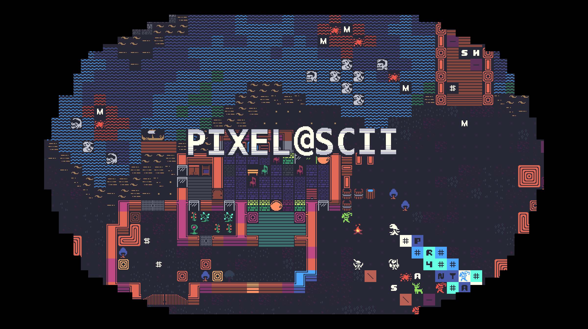
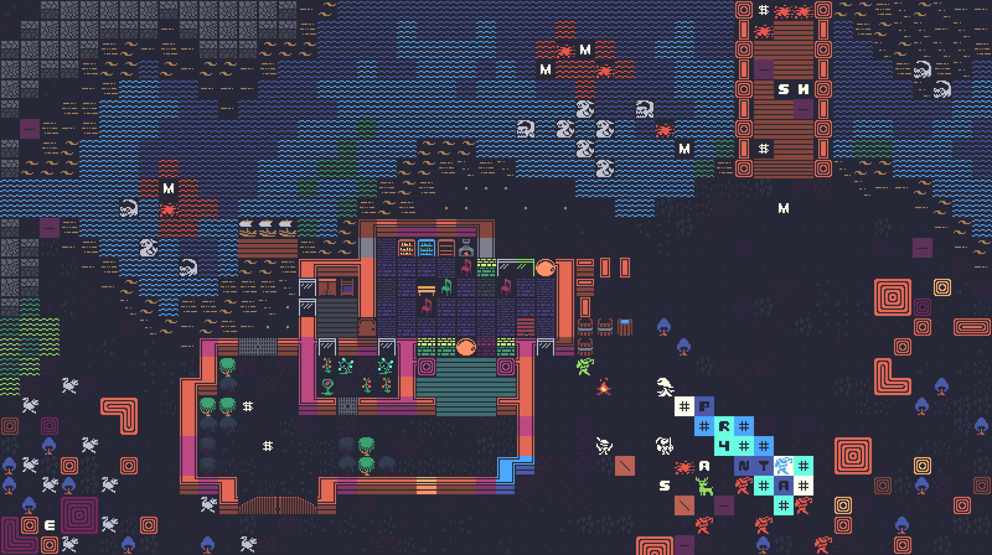
Hey everyone! This is the first devlog for my project Pixel ASCII Edition, a tileset that blends retro ASCII aesthetics with modern pixel art style. The goal is to create a set of assets that are both visually striking and practical for developers looking for a unique style for their games.
I’m excited to share the progress so far, the challenges I’ve encountered, and how I plan to overcome them!
Progress
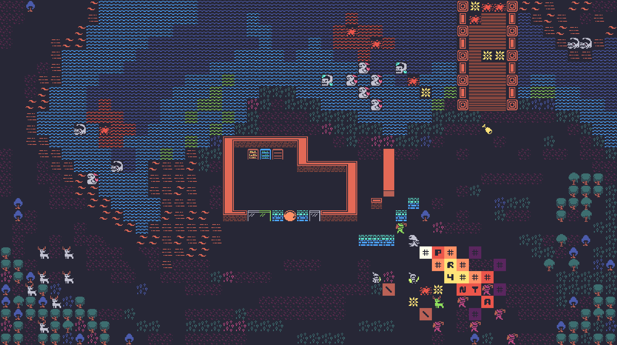
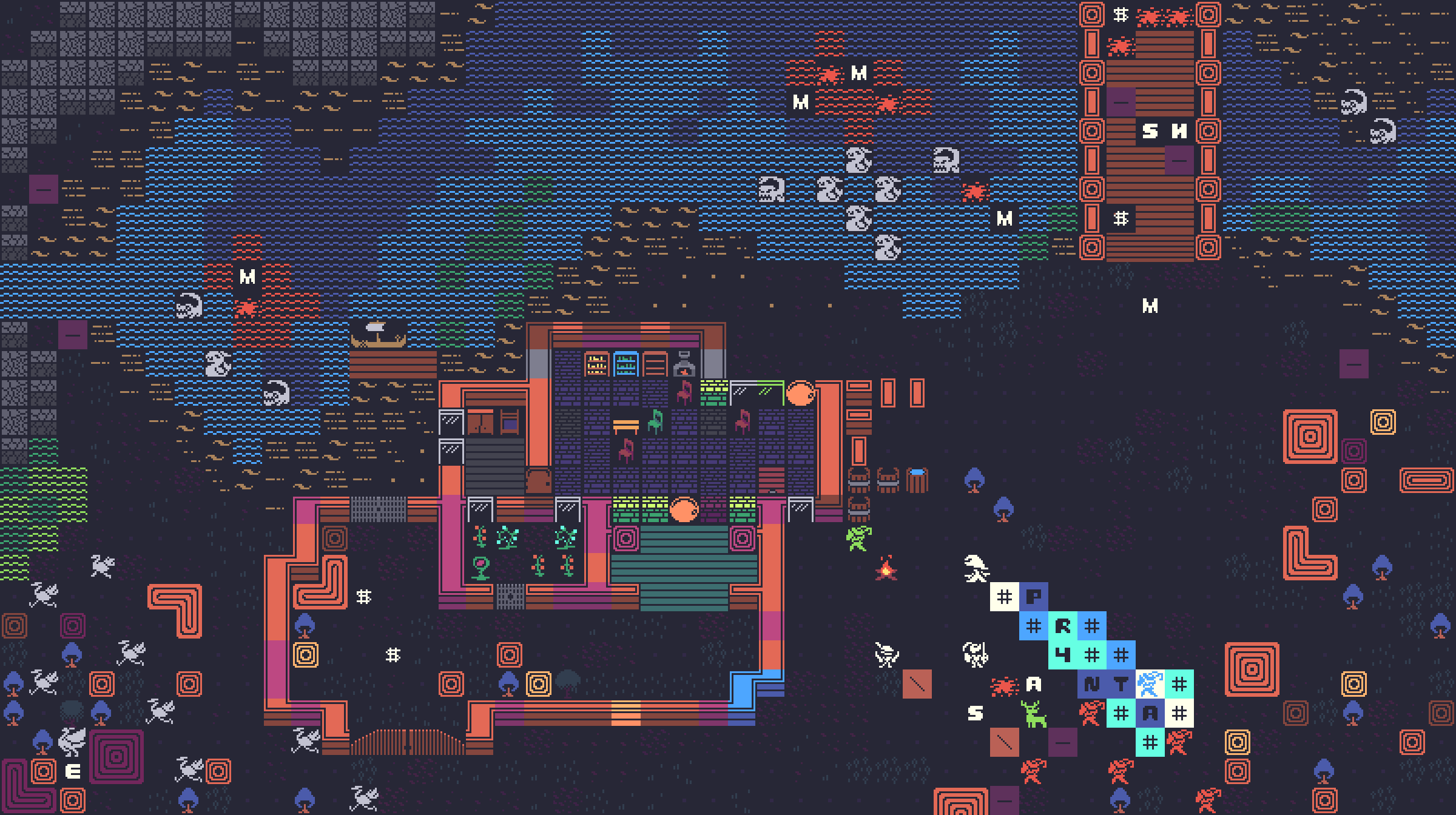
The journey so far has been challenging but rewarding. I started by creating a simple, modular tileset that would be perfect for retro and roguelike-style games. Here’s what I’ve worked on so far:
Basic Tileset Creation:
I began by laying out the initial blocks and textures, experimenting with color palettes that are vivid and eye-catching while staying true to the retro aesthetic.
ASCII Table Implementation:
The idea of incorporating a custom ASCII table came up when I realized it could give developers more flexibility with the set. This allows users to easily adapt the tileset to their needs while staying within the defined style.
Challenges Encountered:** **
Of course, the road hasn’t been without obstacles. Here are some of the key challenges I’ve faced so far:
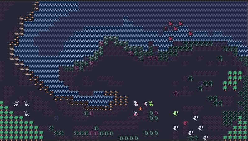
Lack of a Strong Visual Identity:
Combining ASCII with pixel art is an exciting concept, but the initial drafts didn’t quite capture the unique personality that the project needed. The textures looked good, but the design lacked a strong identity.
Undefined Silhouettes:
The silhouettes of certain elements weren’t as clear and distinct as I had hoped. In retro art styles, clear and readable shapes are crucial, especially when it comes to small tiles.
Color Contrast Issues:
Some of the early tests revealed problems with readability due to color choices. Certain details were getting lost, making the tiles harder to distinguish at a glance.

Next Steps & Refinements
I’m already making plans to address these issues and improve the overall quality:
Refining the Visual Identity: I’m focusing on adding more contrast and defining clearer lines to make the tiles more visually striking. This includes simplifying some elements and making sure each tile has a distinct personality.
**Silhouette Improvements: **
To make the shapes more readable, I plan to adjust the outlines of objects and characters, ensuring they stand out more clearly against different backgrounds.
Color Adjustments:
I’m revisiting the color palette to make sure there’s better contrast, especially for smaller tiles and more intricate details.
What’s Next?
Moving forward, I’ll be adding more tiles to the set, expanding the variety of environments, objects, and creatures that developers can use in their projects. I’m also working on creating a demo that will allow people to try out the tileset and provide feedback. The goal is to create a tileset that’s both functional and visually compelling, and your feedback will help me get there!
Thanks for following along with this devlog! Stay tuned for the next update as I continue working on Pixel ASCII Edition.
Leave a comment
Log in with itch.io to leave a comment.